TTWAAR Presents - Rad Album Covers : A Collection Vol. 3
- Skip

- Dec 23, 2018
- 7 min read
Updated: Dec 24, 2018
Been a while, hasn't it? Please enjoy our wares, which boast another magnificent ten rad album covers, with a bonus oddity thrown in. Y'all ready? Let us begin.

Hevisaurus - Hevisaurus, 2011
Hevisaurus are the brainchild of Finnish drummer Mirka Rantanen from the power metal band Thunderstone. They're a band of dinosaurs who play heavy metal to Finnish kids, and if that doesn't do it for you then there's the justifiably rad album artworks attached to their legacy. It's hard to decide which one is worthy of this listing, but Räyh! shall take the place simply because it almost seems as though the band have thwarted the deadly comet destined to wipe out the dinosaurs, which is now nothing but fragments of space rock flying past the band. Metal horns, studs, spikes, leather, and dyed crazy hair - these dinosaurs mean business.

The Birthday Party - Junkyard, 1982
Australian punk band The Birthday Party sought out the talents of famous Rat Fink artist Ed Roth to design their third album. Ed is the father of the monster hot rod art, so this may explain why you might find his work presented here somewhat familiar. The bloodshot eyes, the over-sized mouth, the general over-emphasized grotesqueness and the bitchin' motor - that's Ed Roth's signature, baby. You can also spot Rat Fink, whom is to Ed what Mickey was to Disney in some respects, perched on a headlight firing off some rounds of an assault rifle at a cat. Pretty fucking neat, right?

Boney M - Love For Sale, 1977
This really isn't okay, is it? Naked black chicks in chains under the title "Love for Sale"? Come on now. Still though, check out Bobby Farrell at the back there. There he is, with his chest adorned with thick, luscious hair and a swanky moon pendant necklace; he sees no issue in what he's doing and will not stand for naysayers. "We got a problem here?" says the look on his face, as he displays his manhood which is nestled within a golden hammock, warning you of a level of masculinity which you cannot challenge, because he and only he will win. I am absolutely astounded that this didn't get in more trouble than it did, or that it hasn't been picked up on sin recent years by folk looking for an outrage - the most backlash they ever received was from Atalantic Records who dubbed it "too raunchy" back in the day. I can guarantee you that this lack of outcry comes down exclusively to Bobby; no one is challenging a man who can hold himself so well in a situation like this.
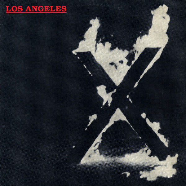
X - Los Angeles, 1980
Speaking of racist undertones, here's a big cross on fire on a patch of grass. No it's not that type of cross, but that's the point, isn't it? You think of THAT cross when you see it and that's what makes the album stick in your mind, at least that's what I imagine that was the intention by punk band X when they commissioned the artwork for their most famous album, Los Angeles. Nothing says punk rawk quite like taking something that makes those fuckin' normies feel uncomfortable and throwing it back in their face with a fuck you attitude. It's the rad album artwork equivalent of hitting someone with their own hands - see they think you're doing something bad, but really, if they think about it, it's actually them responsible for the bad thing they're witnessing. Anyway, X's singer Exene is a crazy old lady now who thinks the Sandy Hooks massacre was a conspiracy theory amongst other totally logical things, so the cross burning on their album cover is now a lot more uncomfortable. Still looks cool, though.
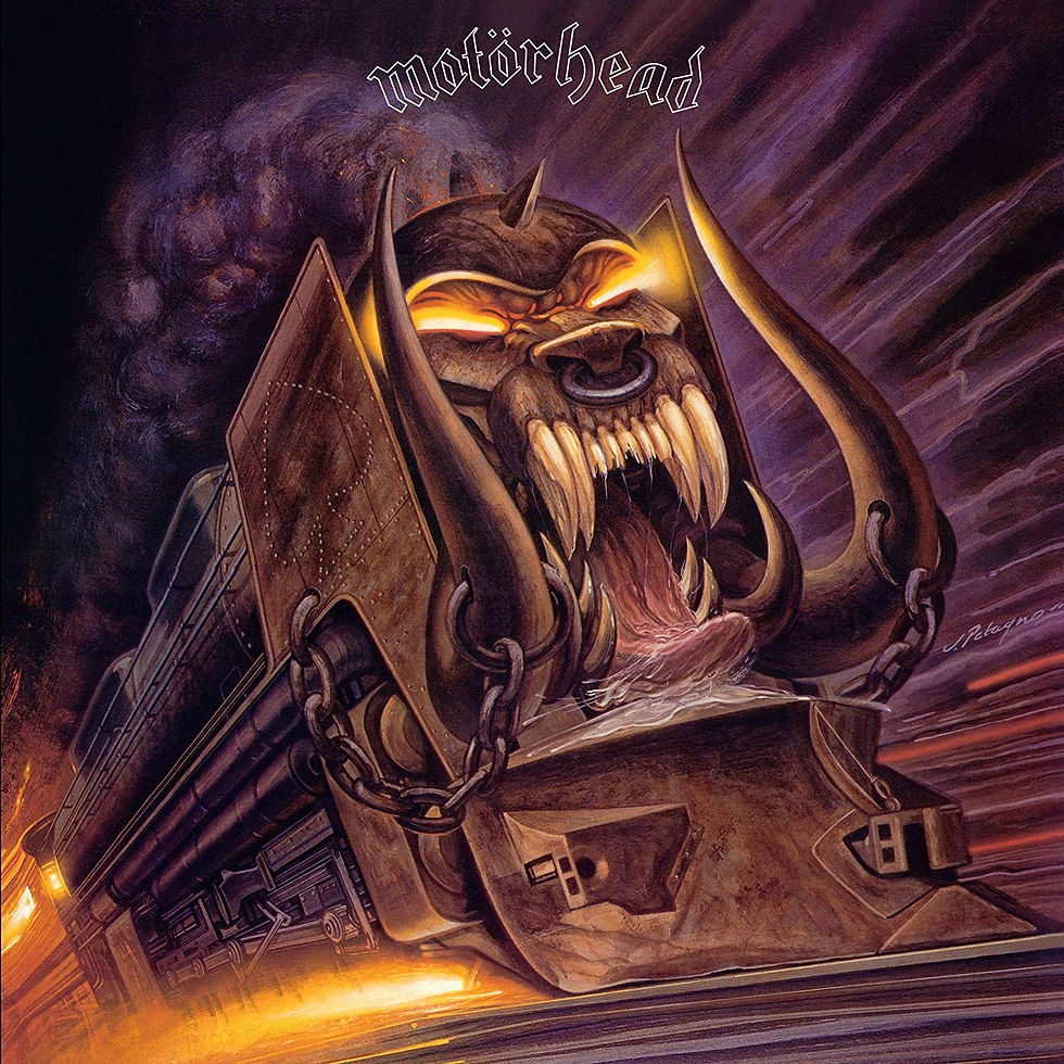
Motörhead - Orgasmatron, 1986
They say an image can tell a thousand words, however let me tell you that there are a thousand words you could probably tell about the cover to Motörhead's seventh album Orgasmatron. I'll give you the short version though: The original title was Ridin' With the Driver, but then the band decided, quite rightly, Orgasmatron is way cooler sounding name. Problem is, the album artist Joe Petagno had already painted a train based on the original title, and also because Lemmy was really into trains at the time. "I want a fucking train", he allegedly told Joe. Lucky for Joe though, a big, thick, angry looking train with an open mouth and tongue protruding worked just as well under the new title. People don't seem willing to admit trains can be pretty rad, but Lemmy knew what was up, and so we are gifted with this.

Asia - Asia, 1981
The Rad Album Covers collection seems to gravitate heavily to 80s album artwork, but frankly when the era presents us with so many zingers such as the above it's not so much an issue of favouritism, but more so that all the other eras should pull their fingers out of the collective arses and try to create something of this caliber. Asia are pretty rad in themselves, but their self-titled debut album surpasses them by far. Here we see a large sea serpent of myth crashing out of the ocean, staring intently to a floating, glowing orb. Is this a sea serpent egg? or perhaps an advanced alien life form seeking battle with the beast? Who knows, all we know for sure is that this sure is some purebred rad album art.

Sodom - M-16, 2001
See, I bet you thought we'd gone for another 80s album, right? Well looks can be deceiving, because this gem actually comes to us from the strange era of the 00s. It was a time when nobody quite knew what they wanted to be or what they wanted to do; people wore big trousers with chains hanging off them, or shirts with flames on them, and some even collected rubber arm bands to look cool rather than to raise awareness for the charities selling them. Truly, it was a time of mystics and sorcerers. It was also the time of M-16's release, an album all about the Vietnam war by the German metal band Sodom. There are some pretty graphic and haunting photos from the Vietnam war that have been used countless times to convey the horrors of it, however Sodom were more concerned about their songs being metal as fuck, so they skipped all that real life bullshit to create the image of some kind've Warhammer 40k guy carrying the charred remains of his buddy through a wall of flames. It definitely was a bold move, but it works.

The Jackson 5 - Victory, 1984
Everyone in the Jackson 5 were kinda hating on each other when Victory was in the making, so there was no chance of getting the five together for a photo to bless their album's cover. So the job of album artwork was given to Michael Whelan, famed sci-fi and fantasy artist, responsible for a number of rock and metal album covers, and even Meatloaf's Bat Out of Hell. The product of this is something that would look right at home on the side of a fair ground ride along side spray painted images of Nicholas Cage or Pinhead. Everyone is dressed pretty great, but then there's Michael with his glowing shoes and glove who really steals the show. As you can see, they're all standing on a highway which suddenly veers off at a ninety degree angle to some far off galaxy in the distance, which is illogical but downright rad. Apparently Randy originally had a white dove perched on his shoulder, but this was worked out. What a shame.

Daft Punk - Discovery, 2001
What we see here is the far superior Japanese cover for Daft Punk's Discovery, featuring the characters from the anime space musical Interstella 5555, who you may recognise them from the video One More Time. The film was actually created as a visual realisation of Discovery, featuring plenty of sci-fi animated goodness and electro musics. Why they chose not to release this as the universal album cover is beyond me, because this is by far a greater piece of artwork than the one we see in record shops today. Just a bunch of blue folk hanging out in space. Pretty rad if you ask me.
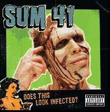
Sum 41 - Does This Look Infected?, 2002
Sure everyone loves All Killer, No Filler's cover featuring a collage of photos of the band pulling silly faces, but it's the artwork to Does This Look Infected and its accompanying singles that mark the band's most raddest of album covers. Clearly a homage to B-Movie posters of old, the cover features a zombified Steve Jocz poking at a hole in his badly damaged temple, asking the question of the album's title. A bit of gore never goes amiss in what can be considered a rad album cover, but the sensationalist movie poster look really seals the deal. You can't go wrong with a parental advisory sticker either.
Well that's all we have time for today, although we'll leave you with today's bonus artwork:

Wild Colonials - This Can't be Life, 1996
Alternative band Wild Colonials decided to be a little alternative with their album artwork here, re-using an old Polish postcard of a carrot family enjoying a nice day out in the field, with a adolescent carrot playing an accordion to keep the dream alive. What really keeps you looking at this cover however is what I assume to be the father's face. He's giving you a look as though you've intruded on a very special family event, and you're far from welcome. I mean fair play to him, he just wants to chill with his family and listen to his son shred it. Who are you to put a downer on that?
So there you go, we hope you enjoyed it. Join us again soon for another wondrous installment of the Rad Album Covers collection, sometime in the near future.


Comments